Years ago, the epically progressive world of design began taking steps in a new direction and began gracing the World Wide Web with its talents. Gradually it brought us visually styled webpages far superior to the default Times New Roman black on white look, leaving the feeling of oil on canvas a distant memory.
Even though that was years ago, some avid surfers still struggle with web standard acronyms and need help understanding of the mechanics beyond the pixels. So in the third part of our series, we explore and define the terminology surrounding website design and build:
Website Design and Build Terms:
Landing page
A landing page is, yes you got it, a page designed to land traffic on. Usually crafted for a specific channel like PPC or email, they are often created to encourage a specific reaction from the user after they have landed on the page, like calling a number or filling out a form.
CTA
Call to action. This is commonly a button i.e ‘Click Here’. Generally, it is the first action you want a user to make when viewing your website. Often, the design will be orientated around this main focus point in order to funnel the users focus, thus bringing about an action – the much wanted click.
A/B Testing
Comparing two or more versions of the same webpage (with slight differences). It is done in a competitive manner in order to see which design converts the most traffic. E.g. Changing the headline of the page, altering the colour of a CTA from red to green, or even changing the CTA copy from ‘Buy Now’ to ‘Add to Basket’.
Colour types:
These colour models can be used on your computer screen and for print work.
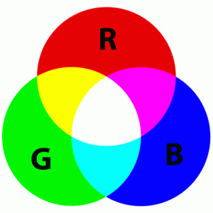
RGB
Red Green Blue is for colours displayed on a computer device using an additive colour model.

CMYK
Cyan Magenta Yellow Black are the four colour inks that make up the printing process for common and industrial printers. When producing a design for print, you would set up your document for CMYK. Print can’t always reproduce colours in the RGB spectrum.
HEX
Hexadecimal colour codes are basically HTML colours. They are the notations for the combination of Red, Green and Blue (RGB) values.
Image file types:
Find out the difference between a JPG, PNG, GIF and SVG image format and when to use them.
JPEG/JPG
Joint Photographic Experts Group image format is the most commonly used method of lossy compression. Often used for photographs, made up of hundreds of colours.
PNG
Portable Network Graphics is a raster graphics file format that supports lossless data compression. This is a great file type for graphics that need transparent backgrounds. Helpful Tip: When posting graphic images to Facebook use PNG as it appears much clearer than JPG.
GIF
Graphics Interchange Format is a bitmap image format that uses a lossless data compression technique. If you want a small image for your website with only a few colours in it, then the GIF format is perfect.
SVG
Scalable Vector Graphics are a vector image format best for images that you want to make scalable on your website. This is great for responsive websites, so you can scale an image to the size of the browser, on your mobile, tablet or desktop computer.
Coding:
Building a website? Here is some need-to-know coding languages and techniques to do just that:
CSS
Cascading Style Sheets are used to style HTML elements. Font-size, width, height, background-colour are just some of the fabulous attributes you can assign. CSS can lay in the HTML or be called from an ‘External Style Sheet’.

HTML
Hypertext Markup Language is not a coding language, it is purely mark-up for your webpage.
JS
Javascript is a coding language born sometime in the 90’s. It is used to do a lot of cool stuff on the web and is still sometimes preferred for animating HTML rather than CSS3 because it has a larger browser support. JavaScript can be is used to read user input i.e mouse clicks or a finger swipe on a tablet.
JQuery
This is a JavaScript library where all the cool stuff you have ever wanted to easily do with JavaScript has become available in just a few lines. Some popular functions we enjoy using here at Found are: .fadeIn, .fadeOut, .toggle, .show, .hide.
CMS
A Content Management System allows you to publish, edit and modify content on your website. Examples of content management systems used Found are WordPress and Modx.
Browser Testing
A website renders differently in every browser and operating systems. It is good to test your website in different browsers and OS to check all HTML, CSS and Javascript renders as intended.
Responsive Design
The ability of a website to respond to the resolution of the device it is displayed on, most commonly desktop, tablet or mobile.
Web Safe Fonts
Fonts that are already installed on most computers i.e Arial, Times New Roman, Georgia. These are web safe in the sense that they are very likely to be displayed by the target user rather than defaulting to another font. New options to embed fonts have become popular but are not always supported in all browsers.
Found is the Everysearch™ agency, a master of search performance across all digital marketing platforms. Employing PPC, SEO, paid social, and creative content, we harness the power of data and AI to craft and execute winning digital marketing strategies.


