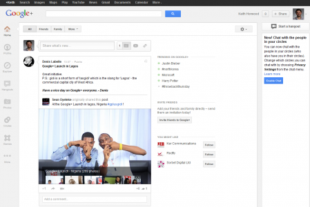
This week, Google released a new interface for Google+. It seems to make sense for Google to make such drastic changes early in the products life. Usually, early adopters can adapt better and test features more than the casual users who have been famously absent from the social network. Well, if you can’t beat them, copy them!
What the hell – I had just got used to the current interface!
The main changes are the new side navigation, which is totally customisable. A neat feature, even if it did take several minutes of expletives before I discovered that my pages were hidden under the ‘more’ part at the bottom of this side menu. I apologise to new desk-pod recruit Kristina for the amount of profanity caused by Google+ this week.
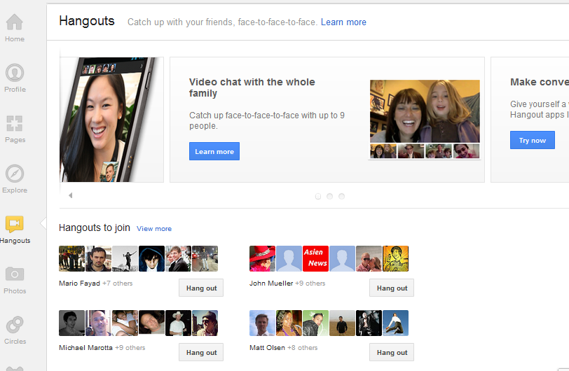
Other Changes highlight visual content such as video and images on the timeline, and there is also a dedicated page for hangouts. Other features have been created by coining the terms ‘activity drawer’ and conversation ‘cards’, which I doubt will enter the lexicon of any digital marketers anytime soon.
An uncanny resemblance to well known Social Networks
Now we all know that Google+ has taken inspiration from both Twitter and Facebook (well, apart from the regular users), but several of the latest changes look very familiar. The first and most obvious of these is very similar to the recent Facebook banner headline image. Google+ now allows you to choose between a wide screen image from your uploaded photos or 5 different images to display at the top of your profile. The difference is shown below; and you can clearly see that the profile image is larger than in Facebook, and on the opposite side. To me it looks like Google has copied Facebook, edited a few items, and have ended up with a bizarro world Facebook.

OK – So what about Twitter?
To put it simply – Google+ now shows trending topics and hashtags very prominently. An obvious benefit of this is that it is already familiar with twitter users. One thing that is interesting here, is that the way Twitter tries to keep things simple is at odds with the ever evolving G+ method. Pretty much everyone understands how twitter works, even if I do hear some very strange stories about lack of understanding. Whenever Facebook make the slightest change people seem to go crazy, like they expect it to stay the same forever. For me, it is one of the best and also the most frustrating things about twitter – you usually need to use apps, tools and other things to bolt onto it.
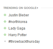
As you can see Bieber fever is skewing the results, so there are plenty of wrinkles to iron out, such as banning pop stars from my trending topics. It seems that many people will then comment on the lameness of trending topics, thus making it worse. It is a viscous circle that Google need to make their highest priority.
If Content is King, What does that say about Google+?
It is in vogue to poke fun at Google+, but you cannot argue about some of great the content that is shared on there. One of the coolest things I found recently was Project Glass. Project Glass was launched with a very cool video that shows what a possible sci-fi Google world may be like in the future with new ‘social spectacles’. Even better was the Microsoft BSOD spoof of this that followed which was a shared by a friend on Google+. If you do not know what a BSOD is then you must be very young. Using Youtube I then found out how to play the song used in the Project Glass video on the ukulele. The song used is ‘Lovers Carvings’ by Bibio, which was also used on the Kindle adverts about a year before. So is Google copying Amazon now?
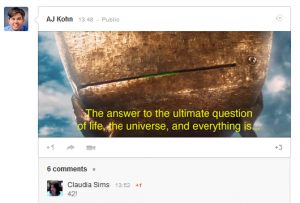
Anyway, the main point I am making that once you are using Google+, for me it is a worthwhile experience. I even found out the meaning of life.
How far will this integration go?
Integration is happening all over Google’s services, as they streamline into ‘a simpler and more beautiful Google’. Little things keep popping up everywhere. One of the ‘PG Tips‘ this week was that in Gmail you can choose to search normal Google search too, via a drop down menu.

This place is coming like a Ghost Town
It remains to be seen whether Google+ will remain an almost virtual ghost town, but as a Google fan who wants to interact with Googlers for me it is great. I am not using it to share my latest trip photos with my best friends, I use it for cutting edge industry news. If you are afraid to network online past your friends and family then Twitter and Google+ will not really be for you.
InstaFace
What does this mean for Facebook? Well after the bold move of buying Instagram for $1 billion, I am not sure these changes will overly concern them. What I would do if I was Google, is improve the standard Android camera app, so it works more like Instagram. Currently it seems limited in comparison and now that Android users can install the Instagram app itself, Google have missed a trick.
Key Thoughts and Questions:
• New Google+ Interface: Worthwhile changes or just copying established social networks?
• Google+ UK TV Ad: Effective or too much like the classic Werthers Original ad?
• Instagram: Expensive or wise move into more mobile sharers? Should Google improve it’s photo / camera application to adjust photos for Google+?
• Project Glass: Cool project to spend some of that money?
So, Google are relentlessly pressing ahead, pushing Google+ for greater exposure. I can’t wait to see what happens next.
