I don’t know about you, but I’ve had a recent budding obsession with all things ‘Infographic’. It floats my boat that even some of the more mundane facts and topics can become Infographic-tastic.
If this phenomenon has passed you by and you are wondering, “What is this Infographic thing she is talking about?”- Here is a definition you will find on Wikipedia:
Information graphics or infographics are graphic visual representations of information, data or knowledge. These graphics present complex information quickly and clearly, such as in signs, maps, journalism, technical writing, and education. With an information graphic, computer scientists, mathematicians, and statisticians develop and communicate concepts using a single symbol to process information.
You see…you did probably already know as they’ve been around for a while. They are the things that the news, newspapers and magazines do so well, with teams of data scientists working through reams of data. You could say that an Infographic in a primitive form is what you would draw on a back of a napkin to explain to someone numbers, technical titbits and to make comparisons.
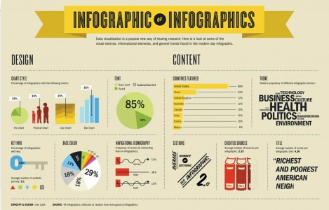
Here is an ‘Infographic of Infographics’ (try saying this fast – 5 times in a row…!) which looks at some visual devices, elements and trends in today’s infographics:

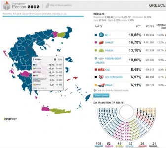
The Guardian has been leading the way with their ‘DATABLOG’, which takes things further by making Inforgraphics interactive. One example that updated in real-time was the Greek election results map, which was being updated as more results were coming in by the minute. You can also download the data used in their Infographic – nifty!

With recent developments in User Experience like CSS 3D, which transforms web elements into cool, 3D graphics, the possibilities for the future are exciting. It’s a win-win for businesses and customers and makes the web much more interesting and interactive than a text-only experience can provide.
Being straight to the point, detailed, and insightful means that it is easier to grasp what the statistics really mean. You can’t deny that web users with their diminishing attention spans will be drawn to these visually pleasing, cleanly presented, factually interesting, relevant and well displayed information nuggets.
All of this also has the added benefit that people love to share these data visualisations using social media. Businesses can keep things topical on their websites, in social media or on their blog, by producing well-timed infographics that are far more likely to be shared and means more people visiting the site, sharing important information, as well as more new visitors!
I hope this has whet your appetite and, of course, in celebration of the Queen’s Diamond Jubilee last weekend let me leave you with a lovely Infographic created for Dartington Crystal.
Infographic Resources:
If you want to have a go yourself here are a couple of sites that will keep you entertained for hours and some other useful resources:
Google public data – lets you easily take public data and transform it into an Infographic
The New York Times Visualization Lab – allows readers to create compelling interactive charts, graphs, maps etc…from data made available by Times editors. Uses technology from I.B.M research called Many Eyes, which has been specifically design for The New York Times.
Can’t get enough? Feast your eyes on these:
http://mashable.com/follow/topics/infographics/
http://pinterest.com/search/?q=infographics
https://pinterest.com/1stwebdesigner/top-social-media-infographics-in-2012/
http://dailyinfographic.com/ – for your daily fix
Found is a London-based multi-award-winning digital growth, SEO, PPC, Social and Digital PR agency that harnesses the efficiencies of data and technology and future-thinking to help clients grow their businesses online.


